Have you ever used Google’s Ngram Viewer? It is an incredible tool. Free, of course. If you don’t know what an ngram is, Wikipedia defines it as “an online search engine that charts frequencies of any set of comma-delimited search strings using a yearly count of n-grams found in sources printed between 1500 and 2008.”
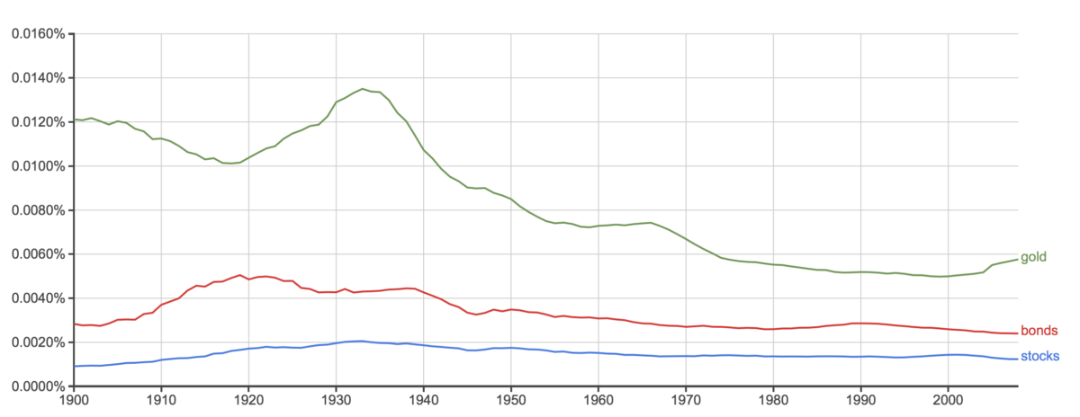
If that is not clear, I will try to define it in very simple terms. It is a chart of the popularity of a word or term or person. For example, I produced a chart of stocks, bonds and gold since 1900.
The top green line represents gold. Notice how it went up during the roaring twenties and continued up into the middle of the Depression. Bond had a bit of fluctuation, but stocks, surprisingly, didn’t vary much and even during the Depression, remained relatively flat. (Please remember, none of this has to do with the prices of these items, only the popularity of these terms.)
Looking at the chart from 1960, stocks, bonds, and gold seemed to drop off, except from the year 2000, gold started to move up.
What else can you find with n-grams? How about the popularity of Warren Buffett?
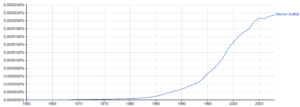
Other that a very slight drop-off from 2005 to 2006, Warren Buffett’s chart has been constantly rising.
Want some more interesting charts? How about Artificial Intelligence?
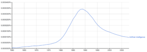
Look how it started to take off around 1980 and started to drop off in 1989.
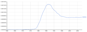
Robotics had a similar run but flattened out at a much higher level than previously.
Finally, lets look at the stock market by itself, without comparing to bonds or gold.
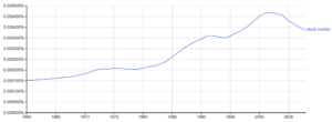
It has been generally in an uptrend, but in 2001 it started dropping and continued to drop.
So where can you find this great tool? just go to:
https://books.google.com/ngrams/graph
Remember, it can be used for searching anything, not just investment information. You can look up topics related to politics, literature, education, and anything else.
One last one for your amusement and especially financial historians:
“bull and bear”
